In what way does your media product use, develop or challenge forms and conventions of real media products?
When creating my magazine I researched other existing music magazines and found out a lot of features that they all have in common. For example, they all have main stream bands or artists on the front cover, which is normally their main interview aswell. The band or artist also seem to be covering part of the mast head on most of the magazines that I researched, which shows how big a part the cover model plays in selling the magazine. It gives the impression that the singer or band on the front cover is selling the magazine rather than the magazine is selling itself. I noticed that each issue of a magazine have a certain colour code and use the same colours throughout the content. So, while I was planning and designing my magazine, I used some of these conventions to develop my magazine. I used the same fonts and colour scheme throughout the magazine. For example, the mast head on the front cover, the title on the contents page and the title on the interview double page spread are all Forever-Bold. I feel my magazine is also a mixture of music and lifestyle, which was influenced by magazines like Rolling Stone and Cosmopolitan. They are two different magazines but I used elements from both to create a music and lifestyle based magazine.
How does your media product represent particular social groups?
My music magazine represents particular social groups through the content. Throughout I referred to artists like Lady Gaga, Kings of Leon and Amy Winehouse, all of which are well known to my target audience which were females between the ages of 16 and 24 who are interested in music like indie and pop. I also think my product represents my target group as girly, feminine and independent through the images in the magazine and the relaxed language I used in the interview, the cover taglines and the contents page. It is appropriate for the working class group I think my magazine will appeal to. As I said, my magazine was aimed at females and there isn’t much that I included that would attract males, although they may buy it if there is a particular interview they are interested in. The main attraction is the front cover, and I chose the photo because it is a strong image that will sell the magazine to the customers.
What kind of media institution might distribute your media product and why?
After researching where other magazines are sold and who they are distributed by, I think that my product would be sold in newsagents, student bars and other places where the target age group would be likely to hang out. I think if it was sold in a supermarket then it would reach a wider audience and attract new buyers, and the bands inside would receive more attention. Also, the internet is another option. My target audience spend alot of time on the computer and therefore if I made my magazine available online, it would become very popular as it is easy to access and always there to view.
How did you attract/address your audience?The audience for my media product would be 16 to 24 year old females who are interested in indie and pop music. I attracted them through the images, language and content used. The images are the main part of each page as I kept a neutral colour scheme for the font throughout, which was black and white. For example, the main image on the front cover is of four girls who are pretty and look like they’re having fun. I found that my target audience like things to be kept simple but interesting so they are drawn in to read the articles, so hopefully my laid-back style will attract them to my product. In my interview with a girl band, I have asked simple but interesting questions and have given chatty, informal answers back with added information, like laughing. The content was part of the attraction because I included articles about fashion and lifestyle, mixed in with the majority of music. The images used are all of girls so this should hopefully make them think that Base is the kind of magazine for them because it focuses on what women like and want. The photos on the contents page give a good example of what the rest of the magazine is going to be about, so this is important to make sure the reader will be interested enough to carry on reading.
What have you learnt about technologies from the process of constructing this product?In the process of constructing my product, I have learnt a few things about technologies. I have learnt how to use Photoshop which I have never used before. Even though this wasn’t my choice to design my final front cover, I had to learn the basics to start with so I could make my decision about which I would prefer to use out of Photoshop and Publisher. In the end I did choose Publisher. I had difficulties with Photoshop because I couldn’t control how the front cover looked as much as I could with Publisher. There were too many choices and I found it too confusing to carry on with. I also learnt how to use blogger. I had never heard of this before and didn’t know how to use it or what to do with it. But when I started to create new posts, I realised how useful it was to present previous work to my teacher and how to explain my choices while creating my magazine. I had already used Microsoft Publisher before, but in a way I learnt how to use it to its full potential.
Looking back at your preliminary task, what do you feel you have learnt in the progression from it to the full product?
In the progression from my preliminary task to my full product, I have learnt how much hard work and planning it takes to create a successful magazine. While producing my preliminary task, I only used one desktop publisher and didn’t know how to edit my photos using Photoshop. But throughout creating my music magazine, I used many programs and hopefully produced it to the best that I could. I have become more confident in the way I use computer technology, editing skills, camera skills and how to address and audience and the research that goes with it. I feel that the main improvement is how authentic my magazine looks compared to my college magazine which, now I look at my magazine, doesn’t look totally professional.


 I like the photo on this cover of NME. Because there's two people and it's on one side of the magazine, the text can go on the other side.
 I produced the front cover and contents page for Chew Valley. I called the magazine ChewVal, and above the masthead is Spring 2009 and below is Our New School Magazine. As we had to use our own photos on the front cover, i took a medium close-up photo of a teacher laughing and a 6th form student. I chose to do this because it looks natural and shows what the school is really like.
 text box and then put them at different heights so it would look squiggly. I think this works better, because the magazine is for children as well as parents and it looks fun.
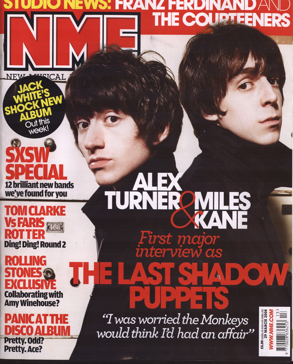 This magazines audience is 17-30 year old men. It isn't a very highly produced magazine, because compared to the other 2 magazines i looked at it hasn't got a glossy cover and doesn't advertise the kind of brands that they do either.
 Q is aimed at older music buyers who are serious about music. It is also probably more for men. You can tell this because when you read it there are adverts for expensive watchs, beer and trainers.


