Using DTP and an image manipulation program, produce the front page of a new school/college magazine, featuring a photgraph of a student in medium close-up plus some appropriatley laid out text and a mast head. Additionally candidates must produce a mock up of a layout of the contents page to demonstrate their grasp of DTP. 
I produced the front cover and contents page for Chew Valley. I called the magazine
ChewVal, and above the masthead is
Spring 2009 and below is
Our New School Magazine. As we had to use our own photos on the front cover, i took a medium close-up photo of a teacher laughing and a 6th form student. I chose to do this because it looks natural and shows what the school is really like.
I kept the text on the front cover to a minimum, and just put taglines of what was inside. For example, there is
Whats inside.. and underneath are short tags of the main articles like
The School Council. Also, i kept all the font on the front cover white, except for the masthead. This is mainly because it stands out against the photo and also it goes well with the colours of the masthead.
On the contents page, i was going to write
Contents in the same font as the masthead on the front page and use the same colours too. But then when i tried it, it looked to similar so i changed it for something abit different. I used a different font in black and wrote a single letter in each

text box and then put them at different heights so it would look squiggly. I think this works better, because the magazine is for children as well as parents and it looks fun.
I wrote the contents in a smaller, different font and for the page number i put it bold and in red. I also added two lines down the left handisde of the page. One in green and one in red. This was just so that the colours were still there on the contents page and just to add abit of decoration.
I have two photos on the contents page too. One is of a teacher and another 6th form student and the other is of a dinner lady in the school canteen. At the top of each photo is a text box with the page number and article it goes with.
Next to those photos, i have a text box with a note from the editor of the magazine. Basically, it just explains the magazine and tells the readers what her favourite parts of the magazine are.
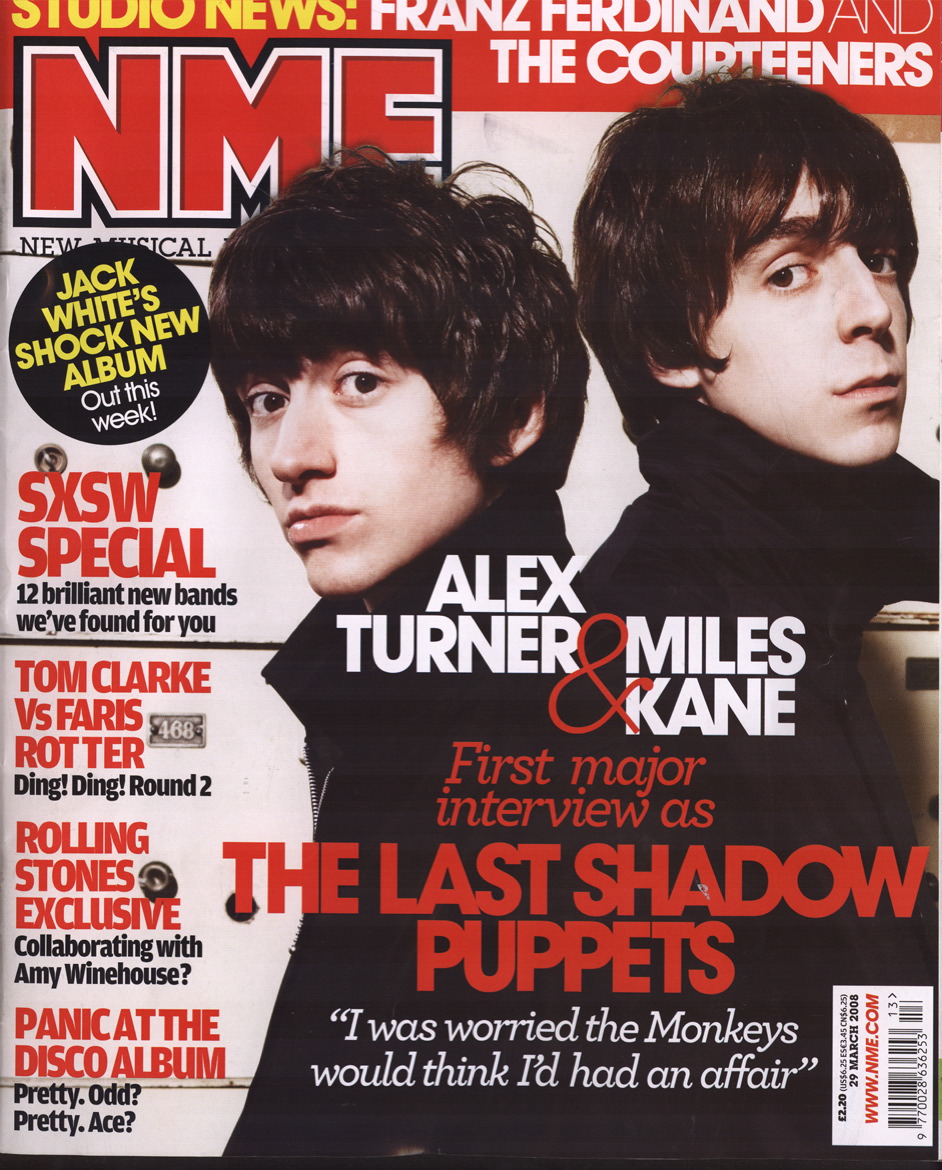
 I like the photo on this cover of NME. Because there's two people and it's on one side of the magazine, the text can go on the other side.